
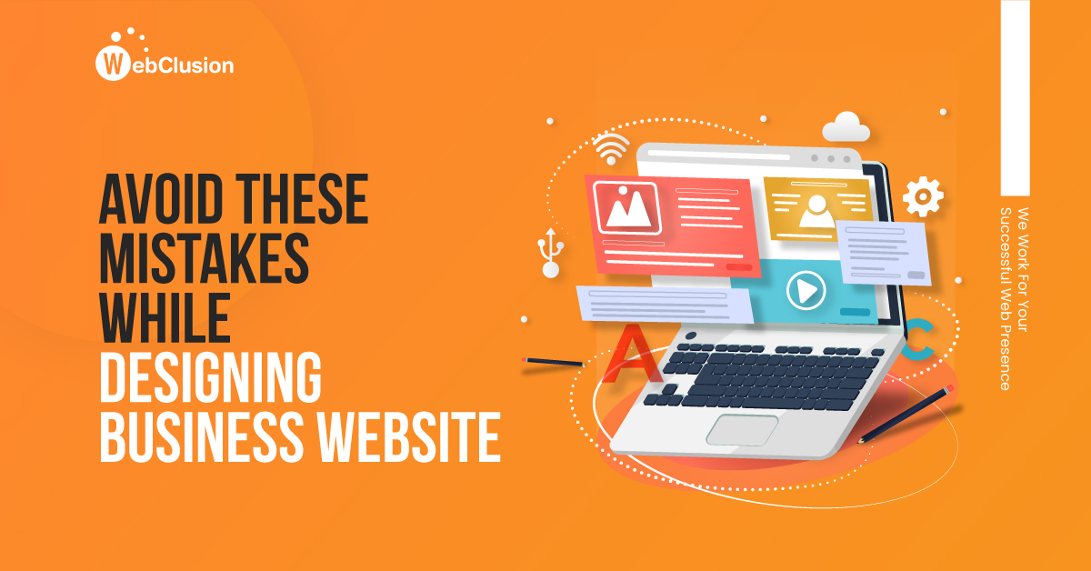
Designing a website is a form of art that is required to give its viewers an experience. A good website is one that provides all the necessary information about the business. However, a great website is one that is beautiful, informative, and functional.
On the other hand, if the quality of the website is poor and doesn’t provide great user experience, you might lose customers. A lot of times, businesses don’t pay much attention to website designing or maintain it regularly in order to save money. What they don’t realize is while doing so, they end up losing more money.
You can turn your website from good to great by avoiding a few common mistakes which we have listed for you in this blog.
1. Assuming Longer Pages are Better
If you can manage to write short and crisp content, stick to it. A long page with a huge amount of text is not only too much effort but also it will be unable to hold your audience’s attention long enough to deliver your intended message. The content has to be written well, easy to understand, and it should be readable. Focus on the terminology, spelling and grammar, sentence structure, and avoid the use of jargon. All the well-established writers suggest breaking up the content into appropriate sub-groupings, which can then be allocated to separate pages. It is important to understand that many readers will ultimately just skim the page, so do not underestimate the importance of subheadings and bullet points.
2. Pop-Ups
While browsing websites you might have experienced pop-ups popping up and taking over the whole screen. In some cases, don’t get the option to cancel them until you provide some details. This creates a really bad user experience which turns the visitors away and increases the bounce rate. A lot of websites these days make the pop-ups ‘pop’ as soon as you arrive on the page. DON’T do that.
Sure, pop-ups have their benefits like getting leads. There is no denying that. But consider waiting for some time while visitors have been on the page for a couple of minutes and then show the pop-ups. Also, ensure that they are creatively designed, easy to close, and not full-screen size. Last, but certainly not the least, make sure that pop-up offer some value to the users.
3. Autoplaying Videos with Sound
Blaring sound out at people as soon as they load your page is not a good way to get attention. Most people browse multiple sites at once and when they hear the noise, they will just look for the page with the sound icon next to it and hit ‘close’. A lot of times, people browse the website at work or in public places, if the video starts to play automatically, then it creates a bad experience for the users as well as for people around them. If you have a video embedded on your website, then remove the sound, or at the very least turn autoplay off.
4. Text Too Big or Too Small
Font size might seem insignificant and something that is easily ignored while designing a website. Some web designers just go with whatever default is and forget about its importance. Users are left to squint at the website trying to read the text and forced to increase the zoom. In some cases, where the font is too big, that also creates problems. Blogger font makes it difficult to follow the flow of the text and fails to grab users’ attention You want users to feel that your site is a joy to read, filled with modern typography. You do not want them to get a headache searching through lots of tiny paragraphs or large words. Do proper research on font style, size, and color at the very beginning of designing a website before uploading the content.
5. Too Many Advertisements
A lot of websites- especially blogs depend on adverts as one of the main sources of income. Sure, adverts make money; but they also distract from your content and undermine your design. Having too many advertisements on one page is not a good idea. It dilutes the quality of the website. If you have too many on the page, they will all be flashing and trying to get your readers to look at them. The result is a sensory overload that causes confusion and ultimately increases your bounce rates. One tends to lose credibility if your webpage has more ads than your own original content. Always keep a check on the ads popping on your website and find out how you can keep the ads on your page while ensuring a good browsing experience for your visitors.
6. Your Website Is Not Mobile Friendly
80% of internet users own a smartphone. There has been a huge spike in mobile browsing as compared to desktop browsing. Users will continue to look for optimal experience and if you aren’t one to provide, you will miss the boat to success.
According to the latest statistics, over 50% of traffic comes from mobile and 21% of those consumers end up converting. With an opportunity this big, your business cannot afford to go without a mobile presence. Google too ranks mobile-friendly websites higher. If your site does not have a mobile-friendly experience, start making changes today!
7. Slow Load Times
One of the main reasons for the high bounce rate is slow loading time. If your website takes longer than 3 seconds to load, you will most certainly lose the visitor. No one wants to wait, everyone wants to find their information fast.47% of users expect a website to load in 2 seconds or less. 40% of users don’t wait and exit the website if it takes more than 3 seconds. Google also states that 3 seconds is the accepted best practice for website owners who want to keep their visitors on-site. Find out what all factors are slowing the loading time of your website and take action.
8. Hard to Find Contact Info
Customers and clients need to get in touch with you easily and they should be able to do so without much hassle. Often, website owners do not show their phone number prominently in the header, footer, or on a dedicated contact page. This leaves visitors with a poor experience.
Ensure that your contact info is mentioned at a pivotal location. The best practice would be to add a contact form as that will also help you gather visitor data.
9. Poor Quality Photos and Images
A website is the first level of introduction to a potential customer, so everything in it needs to be of top quality. Do not simply “borrow” images from the internet, as this is not only illegal, but it can make you look unprofessional. Sometimes, photos or images downloaded from the internet carry watermarks and if used as is, it will definitely create untrustworthiness in the mind of visitors.
Ensure that photos and images are original and of the highest quality. Never upload anything that is blurry or pixelated. If you don’t have the resources to get your own photos, then you must buy a membership of any website that provides royalty-free stock images and photos.
10. Do Not Forget About Google Analytics
Google Analytics is a free tool, and yet a lot of website owners forget to use it for their benefit. A huge difference between traditional and online marketing is the ability to easily test, track, and adjust as and when you deem fit.
Google Analytics is one tool that is most widely used to track website performance as well as user behavior. This tool will give you loads of valuable information about user behaviors and allow you to set up goals to track conversion.
Try and implement these changes on your website and you will notice a drastic increase in traffic, leads, and sales you get from your website.
ssdafas